AWSC Safety Campaign

Goal: Reduce secondary drownings at Australian beaches via a new public
safety campaign. Focus on the importance of flotation devices when
enacting a rescue and further educating visitors about the rip current
hazard.
Media: Flexible.
Single Minded Proposition: A life jacket, a boogie board, an Esky,
or an empty water bottle or two on a rope can save yours and your
child’s life at the beach!
Additional note: The most important thing was to stop
and think, assess the situation, and call triple zero.
Ideation

The goal of this prompt was quite straight forward, however
this project was done on a fairly short deadline so the final
concept is not too complicated.
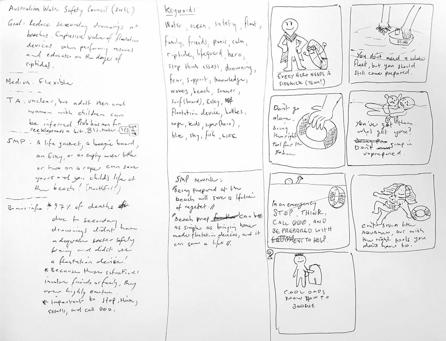
As with all projects I started by noting down all the core
information and then developing a keyword cloud.
An early concept that my mind took me to was the idea of
the male urge (over 80% of affected people were men!) to
"be the hero". This is not necessarily a bad thing, but
heroes don't go into dangerous situations alone.
At first I thought about flotation devices as sidekicks —
Robins and whatnot. However I realised another, perhaps
more obvious, angle was the hero's tools — Thor's hammer,
Captain America's Shield, et cetera. I made the next obvious
connection to sea-themed heroes and ultimately went for a
nondescript Poseidon / Neptune-esque character.
Working the final concept
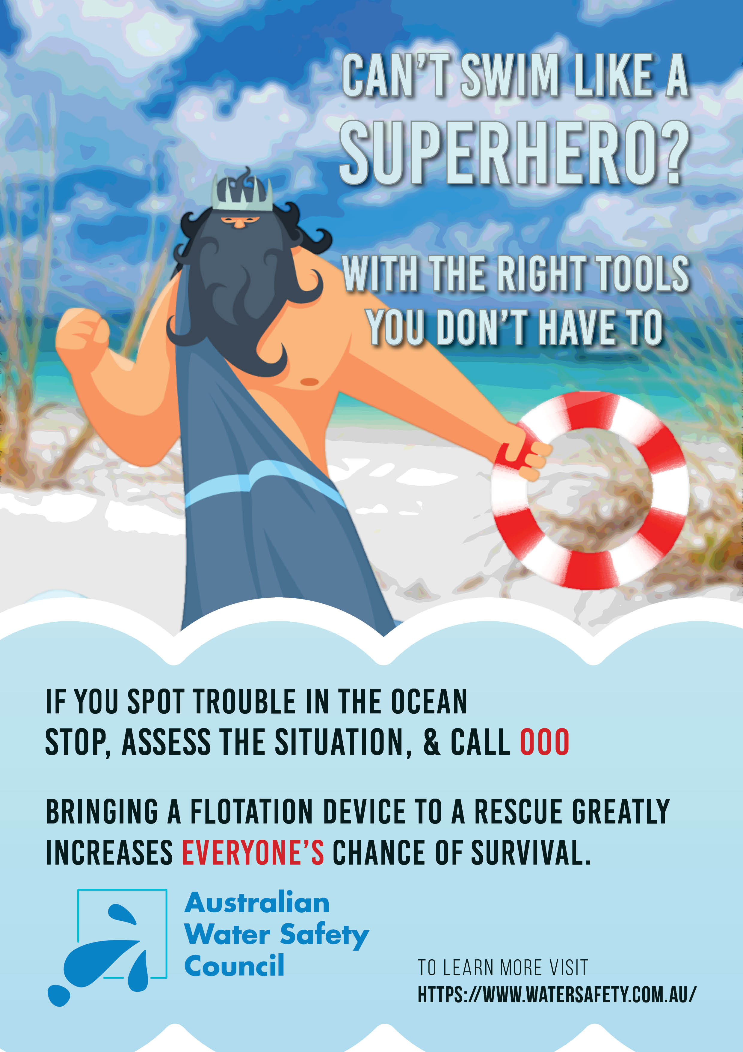
Once again I leveraged a series of Adobe Stock images and some light photo editing to complete the final poster concept.

I edited the trident out of this Poseidon's hand and replaced it with a life saver (made in Adobe Illustrator).

I used this image of a picturesque Australian beach. The final version has
some light filtering to be less prominent.
Initially I was searching for generic beaches but I quickly realised that
Australian beaches have a unique vibe that can't be replicated.
Final Concepts & Refining
Finally, I put it all together in Adobe InDesign using a variety of shapes,
making sure to include some elements that I considered mandatory to the
messaging. A reminder of the steps to take if an emergency occurs and a
simple call to action to visit the website for more information.
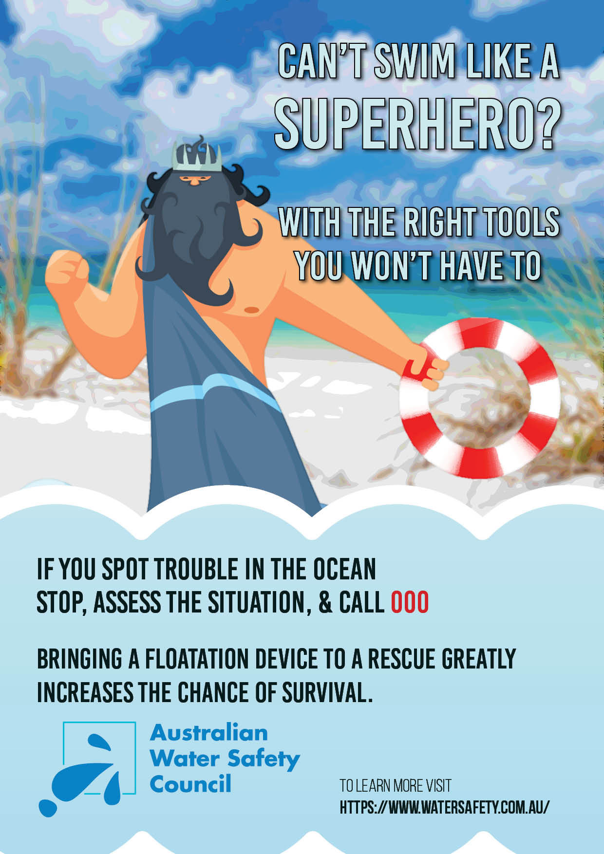
As with the Wear it Purple
campaign, the final design went through a few minor refinements which
are shown below.

