Originally written for Cohost (RIP) in November, 2022
Updated December 19, 2024
This is something I've seen happen frequently in my social media
feeds and I feel it's my duty to aid all letterers of webcomics, manga,
and comic-style mediums. We're a global community and resources like
this should be readily available and widely used for the good of all of
our readers.
First of all, if you're using a mono-case font, that's great!
The choice of whether to use mixed- or mono-case typefaces
for your project is something that should always cross your mind
at least once. I typically find that mono cases have a more
traditional, comic-book style whereas mixed-case fonts are a
little bit more literary, old fashioned, and (at times) feminine.
I love mono-case fonts because you don't have
to worry about whether to start a new bubble with an
upper-case character or not when the previous sentence
ended with ellipsis. I love that I'm essentially
working with
26* letters instead of 52*. There are dozens of great,
free fonts to play with, and hundreds more that creative
typesetters make and sell for cheap on various websites.
Choosing a typeface has never been more fun.
For free to use mono-case fonts I'm personally a fan of CCMeanwhile.
Its thinness makes it nice for lettering Japanese manga which
often have thin, vertical bubbles.
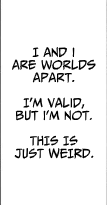
But if you observe the example below, you may notice that
not all letters are so straight forward. This is the crossbar I.

Crossbar I is typically only
used in instances of the personal pronoun "I". In
all other cases, even at the
start of a sentence (even as an acronym like MIB, FBI,
etc), when using a mono-case font in comics you should
always use a normal, non-serif "I". It's
worth noting that this rule doesn't apply with mixed-case
fonts.
It's my observation that a lot of creatives are
unaware of the
importance of the crossbar I and, to an
untrained eye, it may seem like splitting hairs,
but I promise you, your work will look a lot
cleaner and more professional if you adhere to this
simple guideline.

There are exceptions, and as time goes on this
principle of lettering has shifted slightly. If
you genuinely can't stand the crossbar 'I',
or if you think it's the greatest thing ever and
want to use it everywhere, it's not
the end of the world. An accepted alternative is
just to be consistent with your decision.
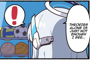
The times it stands
out most is when an errant crossbar I starts a
sentence or appears as a capital 'I' because the
writer instinctively typed a
capital 'I' in a mono-case font. Since no other
character discriminates between lower- and upper-case
it creates an awkward disconnect for the reader.
Every decision we make in communication has a value
and a purpose.
Happy Lettering.
References:
Guigar, B (2016, Jan 8) The Crossbar 'I'. Webcomics.com
URL: HERE
@cendol_plt (2024, Dec 13) Fan Translation!. Twitter/X website.
URL: HERE